Pitch Deck 101
An entrepreneur’s guide to pitch decks
How To Design A Pitch Deck?
Pitch Deck Design: A Guide For Entrepreneurs
Take my word – pitch decks can make or break your startup.
Why, you ask?
Because investors are busy people who devote a limited time to listen to or to read your pitch deck. Hence you need to be double sure that your pitch deck design is legible and aesthetics are such that don’t confuse or bore them.
But let’s face it, a majority of the entrepreneurs are not designers. And when it comes to pitch deck, we play our cards based on research, experience, and best practices.
But if you’re new and lack all of these, here’s a research-backed guide to help you ace the design of your (presentation) pitch deck.
But before we start, here are some FAQs related to pitch deck design –
There are a lot of offline and online tools like MS PowerPoint, Canva, and Slidebean. Each of these tools have their own pros and cons –
- Powerpoint: It is widely used easy software that includes a lot of editing options. It is usually best to share your presentation in PowerPoint format as the investors might be using PowerPoint already.
- Canva: Canva is a free online tool with thousands of templates that can be used to develop a pitch deck. However, you can not download the presentation in PPT format.
- Slidebean: Slidebean is a freemium tool with hundreds of pitch deck examples of existing companies and thousands of templates dedicated especially to help you develop your pitch deck by following the roads carved by unicorns.
Today, Most Modern Monitors Use A 16:9 Aspect Ratio Which You Should Also Follow.
The Design Rules For A Pitch Deck
You might have 100 reasons why the investor should invest in your startup, but the problem with fundraising is that the investors don’t have time to listen to it all.
Now, your job is to streamline your content into 10-15 highlights that may have a similar effect. This is where designing the content comes in.
In truest sense, if you want your pitch deck to stand out¸ you don’t have to pay thousands of dollars to a design company. All you need to do is to make sure that your pitch is easy to understand and that it showcases your purpose and your brand. And for that it has to be –
- Legible: It should be clear enough to be read.
- Simple: The content should state one idea at a time
- Obvious: The content should be able to be understood instantly.
- Branded: It should represent the brand’s promise and vision through its aesthetics.
The Rule of legibility
The pitch deck is of no use if it can’t be read.
Remember, if you present your deck in front of an audience, not everyone sits close to the screen.
If you keep the font to be small and illegible, you just add just another reason for them to not take you seriously.
The rule of legibility states that you should develop your pitch deck with an aim to make people with bad eyesight read your statements clearly without confusion.

Use legible fonts and font style
Pitch deck’s only objective is to complement the presentation. But if people can’t read what you’ve written, it’s of no use. You need to be as legible as possible.
To ace this, use a font that is readable and bold but, at the same time, align with your brand personality.
Finding such a font would be hard unless you know the font psychology. Or you can choose any of these neutral fonts that can go with any personality –
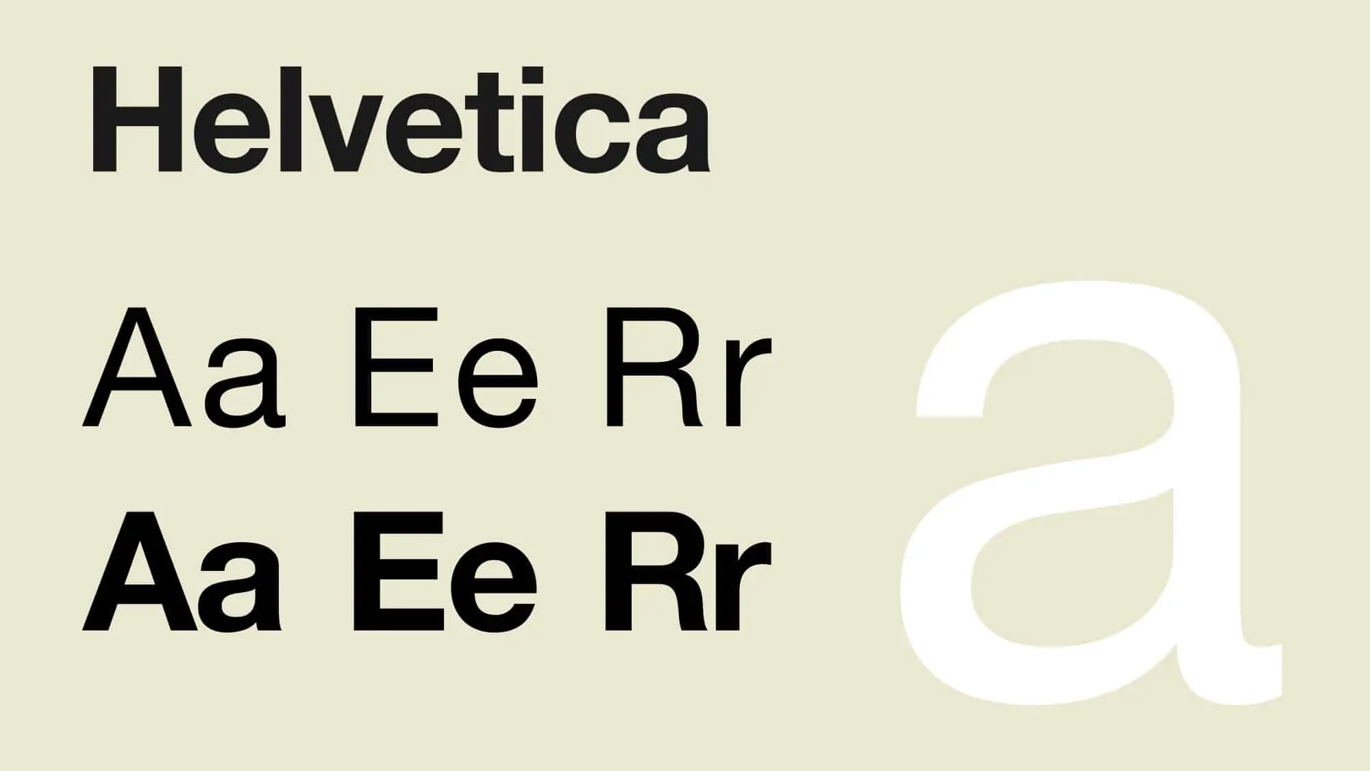
Helvetica
It’s a neutral font that can blend into any style. It is such a robust font that companies like Jeep, Nestle, Toyota, etc. have made it not just their logo font, but also their brand font.
Verdana
Verdana was developed by Microsoft in 1996 specifically to be used on computer screens. The letters are aptly spaced with tall letters making this font extremely readable.

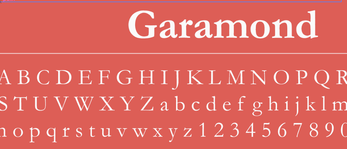
Garamond
Garamond is a professional typeface with a clean and sharp appearance with neutral personality.
Besides these three, you can take a screenshot of any pitch deck example you like and use this tool to identify the font.
Once you’ve zeroed on the font, make sure that you use large text size that’s bold enough to be legible.
Choose A Contrasting Font Colour
The text should have a good contrast from the background or it’ll put strain to the eyes of the readers, making the presentation illegible.
You can make use of online guides to help you choose the contrasting colours for your presentation.
Use Better Alignment
Try to align your text at the top as some readers, especially those sitting at the back, find it hard to read the text at the bottom of your slide.
Explore all the chapters:
The Rule Of Simplicity
A simple slide literally translates to an easy to understand slide.
There are times when fundraisers try to give more than one answer in a single slide. Such overlapping of arguments and ideas result in a complex slide, which acts as a barrier to good pitch deck.
The rule of simplicity states that you should not crowd your slides with more than one argument. One answer per slide.
Choose Small Sentences
Remember that the pitch deck just compliments your actual presentation. It showcases the highlights of your speech.
You don’t need to include entire paragraphs in your pitch deck slides. Remember these two rules –
- Include only the highlights.
- If it can be removed, it should be removed.
Suppose you’re preparing a pitch for a concierge service for b2b business’s clients. Now, which of these sentences will suit the presentation better?
“We handle your clients’ travel, food, bookings, gifts, and hospitality, so you could focus on your job better”
“You just focus on getting clients, we’ll take care of their non-business requirements”
Now, even though the first sentence explains more, it is crowded and not recommended as a perfect line to present the company. The second sentence is also self-explanatory and can be complimented with the icons to make it aesthetically superior and legible.
Different Slides For Different Arguments
If you heading states company’s vision, you only need to explain the vision on your slide. Don’t add milestones in your vision slide.
If it’s important to include milestones, create a new slide to explain the same.
The Rule of Obviousness
If the content of the slides can’t be understood with a glance, you need to change the content in those slides.
Pitch deck slides should be self-explanatory and immediately recognisable. This is because investors are highly impatient beings. They are easily distracted by trivial things like a hard-to-understand slide. And once they lose their interest, it is hard to get them back on track.
The rule of obviousness states that your slides should have the quality to be immediately understood – anyone reading the slide must immediately get an idea of what it is about.
Understand And Capitalise on The Presentation Heatmap
Positioning your elements matter a lot. You would not only want your elements to look bold but you would also want the investors to see them first to make the slide more obvious. This is where you look into the presentation heatmap.
Divide the slide into four quadrants and name them as #1, #2, #3, and #4, like this –

Now, use this hack –
Include the element you want to be most visible in either –
- Just #1
- #1 and #2
- #1 and #3
This is because readers put more attention in these quadrants.
Don’t believe me?
Here’s an example –
Compliment Text With Visual Elements
A slide containing just text is visually less appealing when compared to a slide with text and visual elements like icons and images.
Include more visuals to compliment your texts as it’ll help you in –
- Making the pitch deck easy to read and understand
- Making the pitch deck aesthetically beautiful.
Infographics work even better. Instead of showcasing your data in simple bullet points, use graphs and charts. Infographics make the pitch deck design more obvious and legible at the same time.

You can download such infographics free from websites like Freepik and Canva.
The Rule of Branded Aesthetics
Your pitch deck isn’t yours till the time it reflects your brand identity. Try to develop a pitch deck as one of your brand assets and follow these rules –
- Use brand colours, fonts, and icons.
- Develop headings and sentences in way which fits the brand’s voice.
- Watermark your logo on the corner of every slide.
Also make sure that you’re consistent with it. You can also create a custom global theme for your brand if you’re working on MS Power Point.
Pitch Deck 101
An entrepreneur’s guide to pitch decks
How To Design A Pitch Deck?
