Making presentations is a valuable skill to add to your belt. It makes you an expert in holding non-verbal communication and speaking more visually. Whether it’s for business, school or another form of communication, your presentation depends on five key pillars:
- Platform: Not every platform is tailored to all types of presentations, so choosing the right one is important. For example, Canva or Prezi are great for more creative presentations, while Powerpoint is better for business-oriented ones.
- Content: The main body of your presentation. It forms the spine of your presentation and includes key facts, data and visuals to keep the audience engaged.
- Visuals: Visuals like charts, graphs, photos, and videos help support your content and keep the audience engaged.
- Structure: This is how the content of your presentation flows. It decides whether your audience will understand it or not.
- Bottom line: It’s the takeaway you want the audience to remember.
Creating a presentation isn’t hard once you have the right steps in place. Here’s a complete step-by-step guide to help you make an effective presentation.
Here’s how it goes.
Choose The Presentation Platform

Your presentation platform forms the foundation on which you will create your presentation. The platform can be anything from highly interactive multimedia software to simple presentation apps.
Today, your presentations are no longer bound to be presented in person. You can stream them live over the internet, create an interactive presentation, or even upload them to a cloud storage service.
There is an array of presentation software and tools for every use case. You can:
- Use Canva if you are looking to make a presentation quickly without any technical or design knowledge. You’ll find hundreds of thousands of pre-built designer templates to choose from.
- Use Prezi if you want to add a bit of panache to your presentation, as it is great for creating motion-based presentations in the cloud. Prezi is great for students.
- Create professional diagrams using Visme’s drag-and-drop interface. It contains thousands of icons, images and illustrations to choose from. Perfect for data-oriented presentations.
- Use Google Slides if you want to collaborate with others in real time. With Google Slides, you can make changes and share your presentation online for remote viewers.
- Use Microsoft PowerPoint if you want to create complex animations or advanced transitions. It’s a great choice for experts who tend to manage every nitty-gritty.
- Try Beautiful.ai for AI-powered presentations. AI does most of the job here. All you need to do is just provide it with data.
For those who want to make a presentation in the most user-friendly way, I recommend using Canva. It provides simple templates and an intuitive editor so you don’t have to worry about the technical aspects of creating presentations.
Develop A Persona

Always begin with your audience and the people you’ll be addressing. Before you start writing or researching the topic, answer these questions:
- Who is your target audience?
- Why are you presenting to them?
- What is the purpose, and what do you want to share with this presentation?
Answers to these questions and knowing your audience’s pain points will help you determine the right direction and content to include in your presentation.
Ignore them and risk the presentation being unfocused and vague.

For instance, if you are presenting an idea to trainees, you have to clarify every point, jargon, and term and explain concepts from the beginning.
But if you are talking to your team, you can expect a high-level understanding and focus only on justifying the problem and devising a solution.
Moreover, not only do you need to know your audience, but you need to know their preferred language.
Why, you ask?
Because when you know their interest and attention span, it’s easier to build content to fit their needs. For example, Gen Z prefers visuals while Millennials prefer structured ideas. Hence, a presentation on EVs (electronic vehicles) could be visual or video-heavy for Gen Z and conceptually detailed for Millennials.
Decide On A Type
For every presentation, there is an end goal, and these goals can be summed up in the following five types of presentations –
- Informative: Mostly used in educational settings as they help explain a concept or present an idea. For example, if you’re trying to explain the working of an EV, this would be an ideal type to go for.
- Persuasive: A great way to convince or persuade someone about a product or service you offer. For instance, a persuasive presentation works well when presenting EVs as a better alternative than ICEs (Internal Combustion Engines).
- Entertaining: Presentations used to bring out an emotional or aesthetic response from the audience. For example, when presenting the unique features and design of an EV, this type of presentation works well.
- Instructional: Aimed at providing instruction or demonstration on how to use a product or service. For instance, this type of presentation is best used when explaining the various safety features in EVs.
- Inspiring – Inspiring presentations are to motivate people. It can include a company or a personal journey that is inspiring. For instance, a presentation about how EVs are helping create a cleaner and greener future.
Your presentation can aim at one goal, be a mixture of two, or even be a combination of all four. But know that the more layered your presentation is, the more confused your audience could get. So try to focus on one goal and keep it simple.
Platforms like Canva even have different templates for different goals to help you get a kick start.
Know Your Topic Inside Out
When it is time to present, you need to be confident and presentable to win your audience’s trust.
And you can do this when you know all the ins and outs of your topic.
Focus on the topic’s who, what, where, when, why, and how.
This will help you:
- Be organised
- Answer any questions that come up
- Maintain your train of thought
So, zoom in on your topic and know all that you can to make your slides better.
Create An Outline
It is typically better to separate the pieces you need before you start building rather than digging into a bucket filled with mixed parts for every piece you need.
Begin by brainstorming your ideas and creating a rough outline. It will help you organise your thoughts and identify key points you want to cover.
While working on your outline, be sure to include headings and subheadings and specific talking points for each slide to help structure your content.
For example, an outline for the topic “plant-based diets” would look like this:
- Introduction
- Plant-based sources of protein and essential nutrients
- How To Transition To A Plant-Based Diet
- Conclusion
This would be a headstart. You can fill this headings with subheads like this:
- Introduction
- Definition of a plant-based diet
- Plant-based sources of protein and essential nutrients
- Plant-based sources of omega-3 fatty acids
- Plant-based milk alternatives for calcium
- Fruits and vegetables for vitamins and minerals
- How To Transition To A Plant-Based Diet
- Incorporate plant-based meals gradually
- Finding plant-based alternatives to your favourite dishes
- Recipes and resources for plant-based cooking
- Conclusion
- Recap of the plant-based diet benefits
- CTA
The outline makes it easier to construct and organise the idea sequentially and thoughtfully.
Create Slides And Add Content
Your outline usually decides how many slides your presentation will have. Once you create it, you can go ahead and add in all the content.
The content of the slides is the real ‘meat’ of your presentation – be it data, writing content, or visuals.
The best part?
You can convert this content into three broad sections:
- Introduction – A compelling and strong introduction that attracts and hooks viewers’ attention.
- Body – The main content – facts and figures, analysis, case studies etc. It supports the core message of your presentation and unfolds slide-by-slide.
- Conclusion – It variably includes key takeaways in a way that lets the viewer remind of what they are taking with them. And we add a CTA, which helps with decision fatigue and adds meaning to your content.
For instance, here’s an example of how you can structure your presentation on “plant-based diets”
Introduction
Start with a question to draw in the audience – “Have you ever considered going plant-based?”
Alternatively, use an engaging fact like “There are over 20 varieties of edible plants on this planet!”
Follow this slide with your original idea – the definition of a plant-based diet.
Body
This is where most of your presentation’s content lies. Unfold your thoughts in an organised manner.
Start with a brief overview of the dietary habits associated with plant-based diets and explain why it is becoming increasingly popular.
Then, transition into the benefits of adopting this type of diet: health, environmental, or ethical reasons.
Include visuals like graphs, infographics, and videos to make your presentation more interesting.
Finally, provide ways to incorporate plant-based meals into everyday life with simple recipes and meal plan ideas.
Conclusion
Sum up the main points of your presentation. Remind the audience what they’ve learned and highlight important takeaways that they can use in their own lives.
End with a CTA (call to action) and invite the audience to whatever you’d like them to do – whether it’s trying out one of the recipes you featured or looking into more resources about plant-based nutrition.
Create Your Visual Aids
Here’s a simple fact – the human brain processes visual content 60,000 times faster than text. So when it comes to presentations, visuals can go a long way in helping your audience understand what you’re presenting.
The visual graph below shows the traffic data accumulated through mobile, desktop and all devices with the help of a line graph.
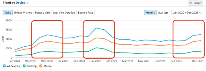
Imagine if this information was penned down in columns, tables, and big Excel sheets – boring to read?
So it is for everyone. So, be more visual.
Presentation tools like Canva, Visme, and Piktochart allow you to create custom visuals quickly using CSV files (spreadsheets) and their pre-made templates.
Even PowerPoint has great graphics and animations that you can use to make your slides engaging. But it lacks the functionality to quickly create custom visuals.
When creating a presentation, think about how you are going to support your narrative with visual aids. If speaking in front of an audience, the ‘show-and-tell’ method is highly effective here. Showing both elements (visual + verbal) will help reinforce understanding in the minds of your audience.
Tips To Make An Effective Presentation
An effective presentation requires careful planning and clear and concise delivery to engage the audience and convey information effectively. Here are the tips that can help you achieve your goal –
Keep It Simple & Crisp
Simplicity is vital if you want the idea to be accessible and easy to follow. You can keep your presentation simple and crisp by cutting down on text and big paragraphs and adding more punchy lines and bullet points.
This makes the audience focus on key points and takes away with them the knowledge.
Develop Clear Structure
Things have to be cohesive and arranged on a logical ladder. Imagine yourself as a viewer and think of the best order for your presentation slides.
You might rearrange sections, and slides, cut on content, add more graphs or images, or some humorous comics.
Be Better At Visual
When it comes to presentations, visuals always play as a wild card. It creates a synergetic interaction between the data and the audience making it easier for the audience to identify trends, patterns, and outliers in large data sets. It empowers the audience to correlate and summarise the findings more efficiently.
To make your presentation visual, you can:
- Explain your idea using a story
- Create comics, and
- Illustrate your points with more suitable images and not content-heavy slides.
If you are a non-designer but want to create a visually communicative presentation, Canva can be your assistant. Its straightforward interface makes it painless to prepare any visuals you want to add to your presentation.
Obey The 10-20-30 Rule
Guy Kawasaki, one of the marketing specialists of Apple, author, and a Silicon Valley venture capitalist, said – Obey the 10-20-30 rule to deliver the best slideshow presentation. The 10-20-30 rule is simple – the presentation should NOT have more than 10 slides, last longer than 20 minutes, and use a font size smaller than 30.
It is not an end-all-be-all rule, but it is great to follow as it keeps the presentation on track and does not overwhelm viewers with too many slides.
Plan The Delivery
You can have the best presentation prepared, but it can be a complete flop if you fail to deliver it right. Here are a few tips to give a killer presentation that helps you share your word across.
- Practice as many times as you can. Because that is the only way to get perfect presentation delivery.
- It is always better to memorise your presentation. The less ‘Ummm,s’ you do on stage, the better. But there is nothing wrong with bringing a note card to have your safety shield.
- If you are not delivering the presentation in person and have to share it with a broader audience – Add voiceovers or a pre-recorded video of you to the presentation. In this, Canva, Loom, Beautiful.ai, and Vyond presentation software can be your help.
- Add the Notes – The Notes pane is the place to rack the talking points that you want to talk about when you give your presentation. You can add notes for every slide.
- Connect with your audience. And the best way to do so is – to research better. When you are comfortable with your audience, know their pain points, and understand what solutions they need, you’ll automatically connect with them and be more empathetic.
- Start a presentation strong to hook your audience or have them ready to doze off. First impressions are extremely important. So, you can start with:
- A personal story outline
- A provocative (but subtle) statement
- Adding a jaw-dropping statistic or fact
- Asking a question
- Show meaningful visuals or videos that create a build-up of your presentation
Bottom-Line?
Understanding how to plan, create, execute and deliver a presentation is an essential skill if you are a professional, teacher, or student. At some point in time, you will have to give a presentation. Despite being an important aspect, it is rarely taught to anybody, which is why we framed an entire article to help you overcome this challenge
Using these steps and tips, you can create a presentation that:
- Communicates effectively
- Engages your audience
- Ensures a smooth presentation
- Achieves your desired outcome
Following these best practices can create a successful presentation and share your message without making people have forty winks.
Go On, Tell Us What You Think!
Did we miss something? Come on! Tell us what you think about our article on how to make a presentation guide in the comments section.
Ravpreet is an avid writer, prone to penning compelling content that hits the right chord. A startup enthusiast, Ravpreet has written content about startups for over three years and helped them succeed. You can also find her cooking, making singing videos, or walking on quiet streets in her free time.
