In today’s digitally driven world, the volume of emails being exchanged is astonishing. A recent look by Statista shows that more than 333 billion emails were shared every day in 2022. This figure is expected to grow, reaching about 347.3 billion by the end of 2023 and climbing to over 392.5 billion by 2026. Among these billions, many marketing emails try to catch our eye.
But here’s a fact: most emails are ignored or deleted.
So, you might wonder, how can your emails stand out? How can you make people want to open and read your emails?
One way to do it is to learn from the best.
It’s tough to sign up for every newsletter and see what works. That’s why we’ve done it for you. We analysed the top 15 email marketing examples to show you what works.
Types of Email Marketing Campaigns
Email marketing can take many forms, each designed to achieve specific goals and engage audiences uniquely. From newsletters and promotional campaigns to transactional emails and customer surveys, the diversity in email marketing strategies allows you to maintain constant and effective communication with your subscribers.
A key part of doing this well is using targeted email designs that speak to your audience.
Whether you’re sending out a sale announcement, a series of informative emails, or just keeping your subscribers updated, customising your emails makes your content more exciting and professional.
Here are some of the most effective types of email campaigns, along with their main goals:
Welcome Emails
Welcome emails are the first direct contact point after a subscriber joins your mailing list. These initial messages are crucial for setting the tone of your relationship with the new subscribers.
When you send out a sequence—three, four, or five emails—you create an opportunity to establish a sense of familiarity with a new subscriber. It’s also the perfect time to inform them about what your brand stands for, taking advantage of their heightened receptivity to new information.
For example:
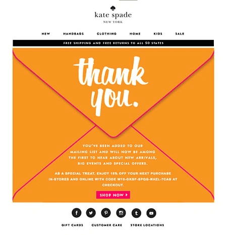
In this welcome email example, Kate Spade employs a straightforward yet impactful method to express appreciation to those who take the moment to subscribe. They feature a “Thank You” in prominent, bold text. This approach, including the “Thank You” on an image of an envelope, recreates the sentiment of getting a genuine thank-you note in the post. Additionally, providing a 15% discount code certainly adds to the gesture’s appeal.
Welcome emails’ main goals include introducing your brand, outlining what subscribers can expect from your emails, and encouraging them to take the next steps, such as making a purchase or following your social media channels.
Newsletter Campaigns
Newsletter campaigns are about keeping your subscribers informed and engaged over time. They can include a mix of content, such as company news, product updates, and useful tips or insights related to your industry.
While not traditionally categorised as a “campaign” due to its ongoing nature, a newsletter or digest serves as a consistent line of communication between you and your subscribers.
Newsletter campaigns are about keeping your subscribers informed and engaged over time. They can include a mix of content, such as company news, product updates, and useful tips or insights related to your industry.
For example:
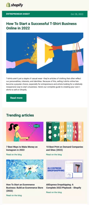
Shopify is a versatile platform widely favoured by ecommerce brands, and the reason for its popularity is clear. In this example of newsletter email, Shopify presents a business idea and several resources that can help subscribers explore the possibility and even start immediately.
These campaigns aim to create a sense of community and keep your audience interested in your brand.
Re-engagement Campaigns
Over time, it’s natural for some subscribers to become less active or engaged with your emails. Re-engagement campaigns are designed to reignite interest among these subscribers.
Consider a scenario where a portion of your list hasn’t engaged with any of your emails for the past six months. The goal of your re-engagement campaign is to either a) revive the interest of these inactive subscribers or b) assess their potential for re-engagement and, if unresponsive, remove them from your list.
Why is it necessary to remove them from your list? These inactive subscribers act as excess baggage, negatively impacting your sender reputation with Internet Service Providers (ISPs) due to their lack of interaction with your emails, which, in turn, may jeopardise your overall email deliverability rates.
For example:
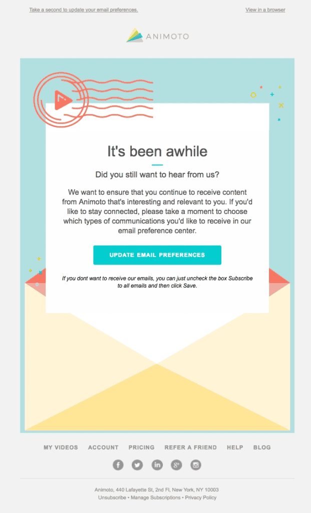
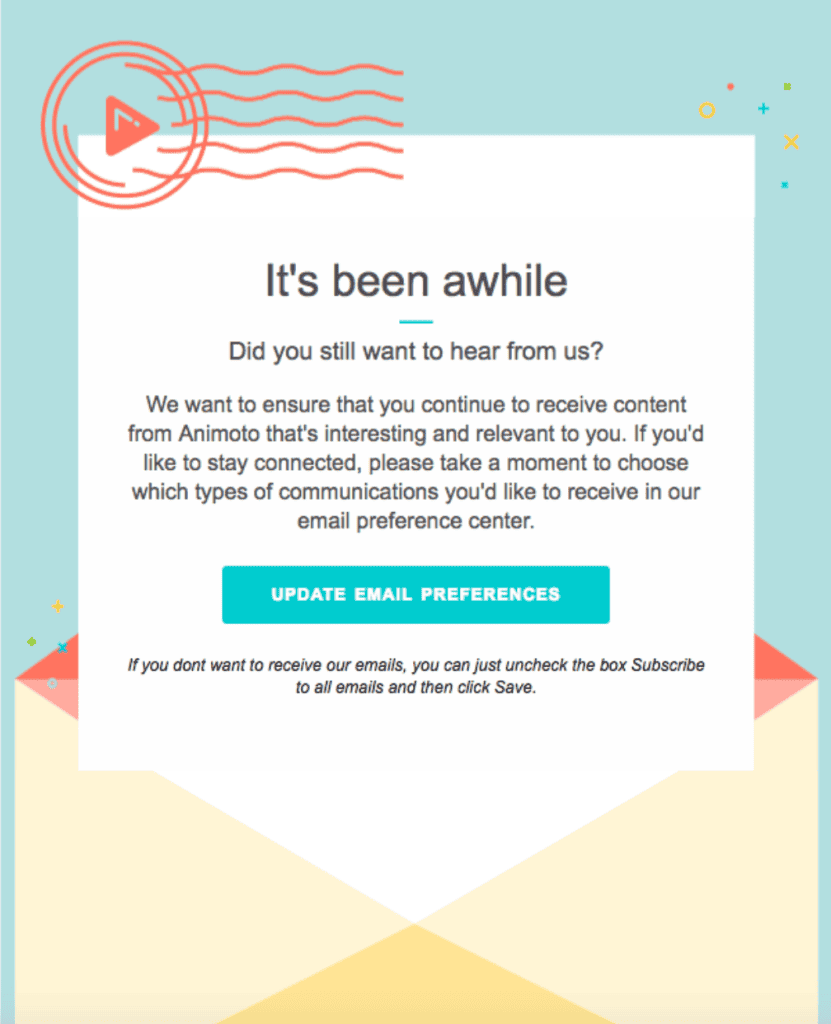
As an example of a re-engagement campaign, Animoto asks, “Do you still want to receive our messages?” They emphasise allowing subscribers to modify their email settings, featuring a clear and noticeable call-to-action (CTA) button that leads to a preferences page.
The primary goal is to remind them of your brand’s value and what they might miss out on if they continue to disengage. These campaigns might include special offers, updates on what’s new, or simply a message asking for their preferences to ensure they only receive the most relevant content.
Cart Abandonment Emails
Cart abandonment emails are strategic messages sent to customers who add items to their shopping cart but do not complete the purchase.
Similar to other automated email campaigns, these messages are activated by users’ specific behaviours— placing an item in their online cart without completing the purchase. Often, these emails encourage the recipient to finalise their purchase by offering an incentive, such as saying, “You left something in your cart. Enjoy a 10% discount to help you complete your checkout.”
Much like welcome emails, this category of email campaigns generally experiences significantly higher open rates and conversion rates.
For example:
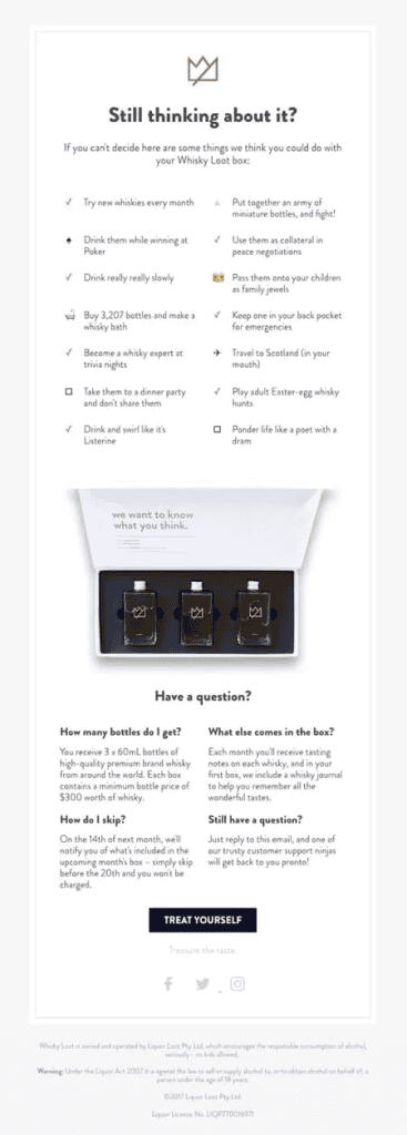
Whiskey Loot’s abandoned cart email grabs customers’ attention with its unique and persuasive wording, nudging them to complete their purchases. They offer persuasive reasons to choose their whiskey, provide clear answers to FAQs, and employ a streamlined design that draws your eye to the CTA. This abandoned cart email equips customers with all the necessary information to purchase confidently.
The primary goal of these emails is to remind and encourage the customer to revisit their cart and proceed with the purchase. This email campaign is particularly effective because it targets users who have already shown a clear interest in your product or service but might have been distracted or undecided at the moment of purchase.
Promotional email
Promotional emails represent the most prevalent type of email marketing campaign and are likely the kind you’re most accustomed to seeing.
Promotional emails are dedicated to promoting a specific product, service, or event. They’re crafted to drive sales or prompt the recipient to take another desired action, such as registering for a webcast, downloading a whitepaper, or taking advantage of a limited-time discount.
For example:
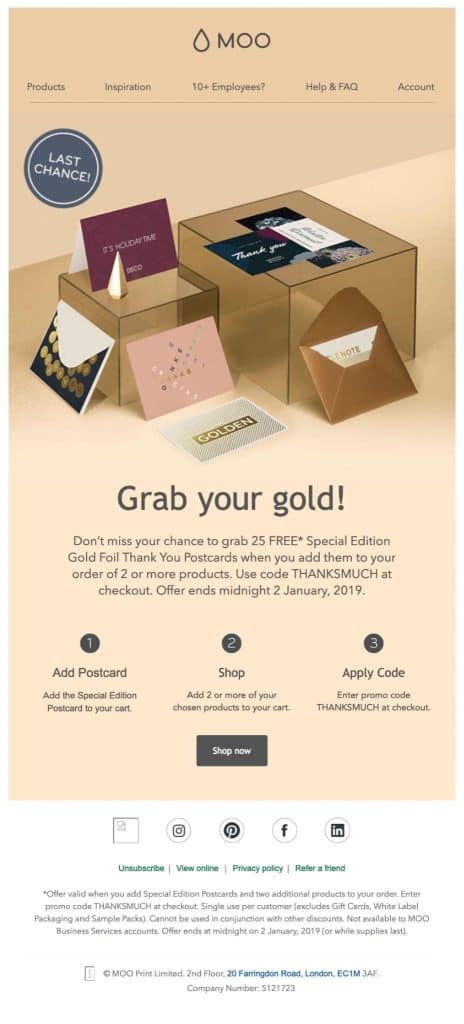
In this promotional email example, Moo uses a ‘Last chance’ image and the notification ‘Offer ends midnight 2 January 2019’ to create urgency. Without a limited-time offer, recipients may decide to delay the purchase until later, and some will likely forget about it completely.
The primary goal of promotional emails is to move the subscriber further down the sales funnel by providing compelling offers and clear calls to action.
Onboarding Emails
Onboarding emails welcome new subscribers or customers and guide them through the initial stages of using a product or service.
Good onboarding emails can significantly improve customer satisfaction and reduce churn by ensuring customers feel supported. You can introduce users to key features, provide useful tips, and offer assistance to encourage engagement and build loyalty.
For example:
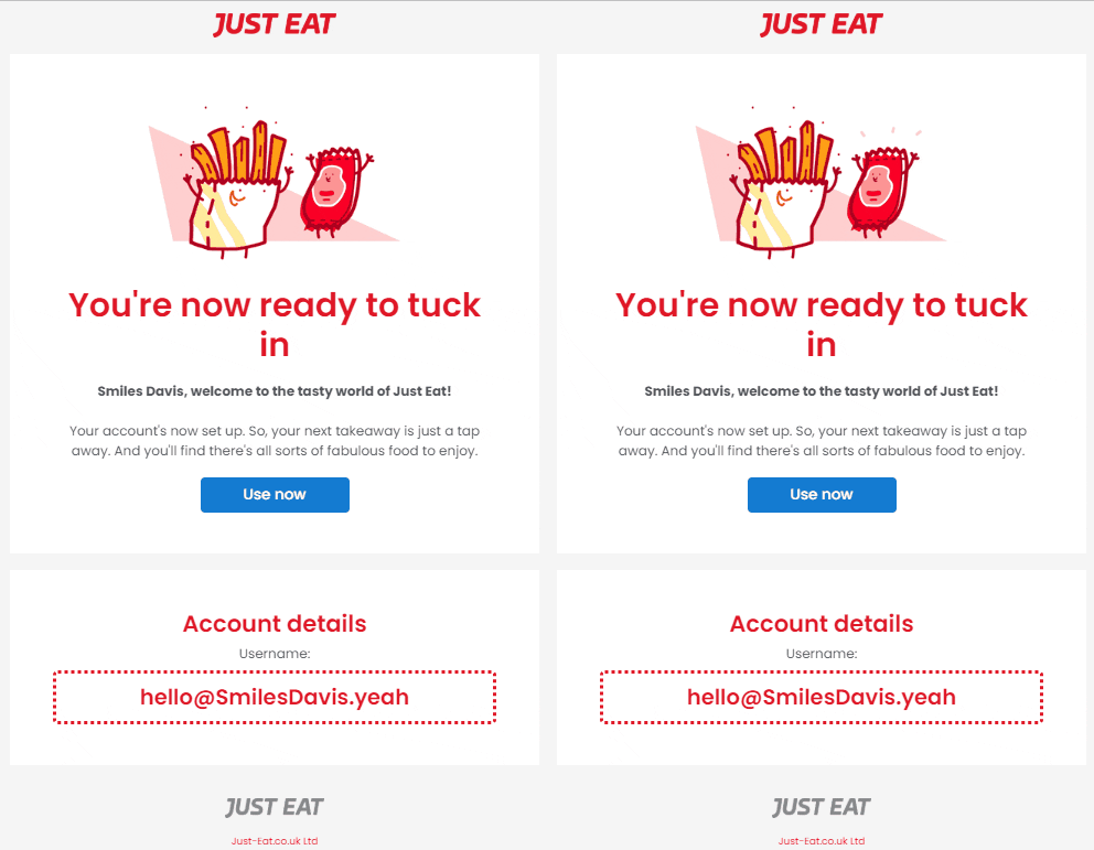
Using Just Eat’s approach as an example of onboarding emails, their welcome email stands out for its simplicity and charm. It incorporates an entertaining animated gif, a playful tagline, without overwhelming the new customer with excessive information or a forceful sales pitch. The intention is to offer a warm welcome and bring a smile to the new customer’s face.
It’s also important to prominently feature your company name within the body of the email and ensure that your sender name is accurately set up. New subscribers must recognise and trust your brand from the start to begin engaging with your emails.
The goal of onboarding emails is to educate new users about what they can expect and how to get the most out of their new purchase or subscription from you.
Best Email Marketing Examples
While understanding different types of email marketing gives a solid clue to running your email marketing campaigns, here are some examples to help you even more.
These companies use a mix of HTML and text-based templates for different levels of their funnels. While you can always create your own templates, several email marketing SAAS like Mailchimp, Brevo, etc., also provide custom templates. Even several third-party websites provide custom Mailchimp email templates or just HTML email templates.
So, take our advice – get inspiration from these email marketing examples but do create your own templates before you move forward.
Starbucks
Type | Goal | Source |
|---|---|---|
Welcome email | Welcoming the user and communicating app features | Starbucks |
Known for its super engaging marketing style, Starbucks is a well known coffee brand that utilises welcome emails to make a memorable first impression as soon as customers sign up.
These emails are crafted with appreciative expressions that not only make customers feel valued but also clearly explain what perks and benefits they can look forward to.
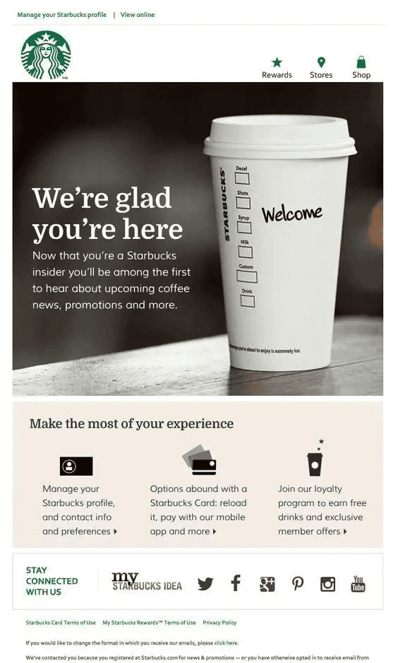
Why it works: The success of Starbucks’ welcome emails lies in their blend of a warm tone with useful information. This smart approach ensures customers feel appreciated and well-informed from day one. Through these emails, Starbucks sets a positive tone for its customer relationship, highlighting the brand’s focus on customer satisfaction.
Starbucks’ strategy of using welcoming and informative emails serves as a strong example for any brand aiming to make a great first impression. This method not only improves customer experience but also promotes loyalty right from the start.
Nike
Type | Goal | Source |
|---|---|---|
Special Day Email Campaign | Designed to capitalise on the increased engagement and interest that accompanies significant events or holidays | Nike |
Special Day Email Campaign emails are customised to connect with customers during celebratory occasions or holidays. They’re designed to leverage the mood of the moment, offering deals, suggestions, and festive content that match the day’s spirit.
Nike shines in email marketing, always hitting the target. For Father’s Day, they’ve crafted a standout special day email campaign.
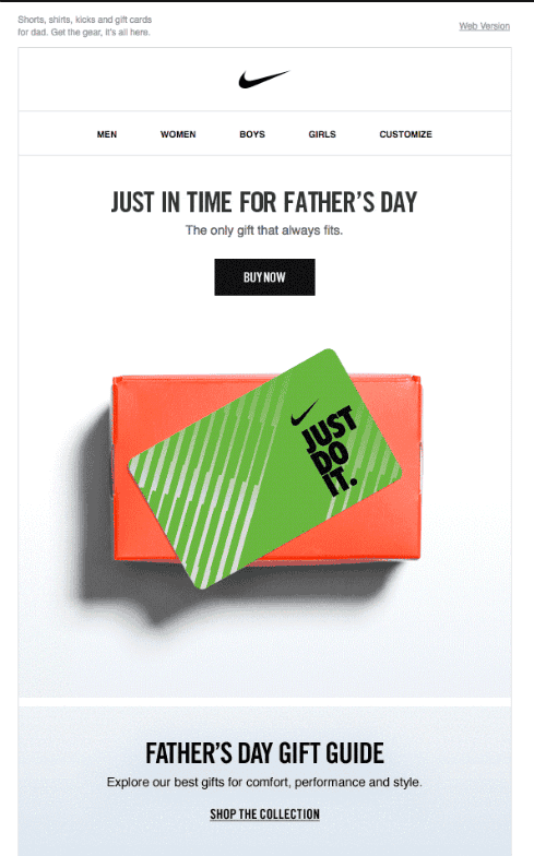
In this email, Nike pairs a striking product image with catchy text. As Father’s Day approaches, finding the perfect gift can be a challenge, and Nike offers a great solution right in your inbox.
This campaign is another reminder of the power of simplicity in creating effective email marketing messages.
Why it works: This campaign’s success lies in its simplicity and relatability. By choosing a product that resonates with the Father’s Day theme and pairing it with succinct, impactful text, Nike taps into the desires and needs of its audience. The clear, direct presentation makes it easy for readers to grasp the value proposition, enhancing the likelihood of conversion.
This strategic blend of visual appeal, relevant messaging, and simplicity underscores the power of well-executed email marketing campaigns.
Revue
Type | Goal | Source |
|---|---|---|
Follow-up email | Designed to engage and nurture leads as they move through the purchasing journey. | Revue |
Follow-up emails play a vital role in continually engaging and nurturing leads as they move through the purchasing journey. These emails provide relevant context, enhance value, and usually include a call to action, like asking for a callback or to fill out a survey.
For instance, consider this follow-up email example from Revue:
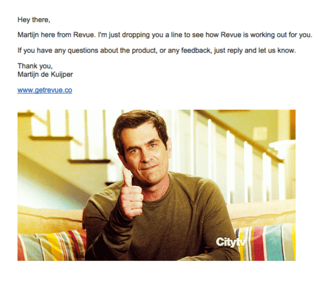
Usually, these follow-up emails are dispatched within 2-4 days using a marketing automation tool. However, the key is in their presentation; notice the email’s clean organisation and conversational tone, which makes it appear as a personalised effort.
Including a contextual image further boosts engagement, enhancing the effectiveness of their follow-up strategy.
Why it works: The structured yet conversational tone creates a sense of personalisation, making the recipient feel valued rather than just another contact in the database. The visual appeal of the contextual image breaks the monotony of text, making the email more engaging.
Thus, The combination of strategic timing, personalisation through conversational tone, and the engaging use of images crafts an effective follow-up email that captures attention and encourages action, significantly improving the chances of lead conversion.
Apple
Type | Goal | Source |
|---|---|---|
Promotional email | Communicating product features and benefits | Apple |
Promotional emails convey information about specific promotions, offers, product launches, or events directly to a target audience’s inbox. These emails help to incite interest, encourage engagement, and ultimately drive sales or participation by highlighting the value and benefits of a product, service, or event.
Apple’s reputation for simple and impactful branding seamlessly enters their email campaigns. Consider this Apple promotional email as a case in point.

Why it works: Apple’s promotional emails are infused with its iconic minimalist aesthetic and the use of clean, crisp fonts, which are hallmarks of its brand identity. This distinct style ensures that recipients instantly recognise the sender, reinforcing its brand image with each interaction.
The use of minimalist design not only creates instant brand recognition but also reinforces the customer’s perception of Apple as a brand identity. Trust and loyalty are strengthened by consistently presenting their brand in this familiar way.
Airbnb
Type | Goal | Source |
Product email | Share in-app features, pursuing users to visit the platform. | AirBnB |
Product emails are targeted email messages sent to inform, educate, or update a company’s audience about its products or services. Airbnb stands out as a leading platform in the travel and accommodation booking sphere.
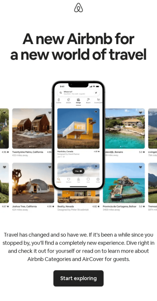
The effectiveness of Airbnb’s email marketing approach is excellently demonstrated through a product-related email that highlights in-app features, encouraging users to return and engage with the app or website.
Why it works: The email incorporates engaging Call to Action (CTA) buttons that utilise impactful, action-driven phrases such as “Book Now” or “Explore Destinations.” These buttons are designed with contrasting colours to catch the eye, drawing users’ attention and prompting them to act.
The design of the email is intentionally minimalist and straightforward, creating a visually appealing experience without overwhelming the reader. This simplicity ensures that the focus remains on the key messages and CTAs.
Airbnb enhances the appeal of its emails with the strategic use of captivating travel photographs and scenic images. These visuals not only beautify the email but also spark subscribers’ wanderlust, making the offerings more desirable and enticing them to re-engage with the service.
Framebridge
Type | Goal | Source |
|---|---|---|
Nurturing email | Designed to build relationships with potential customers by providing consistent value and maintaining communication over time. | Framebridge |
Nurturing subscribers extends beyond just sharing promotional content. It also involves providing value and assistance to prospects, building trust and a positive relationship. Framebridge shows how with one of their best nurturing emails.
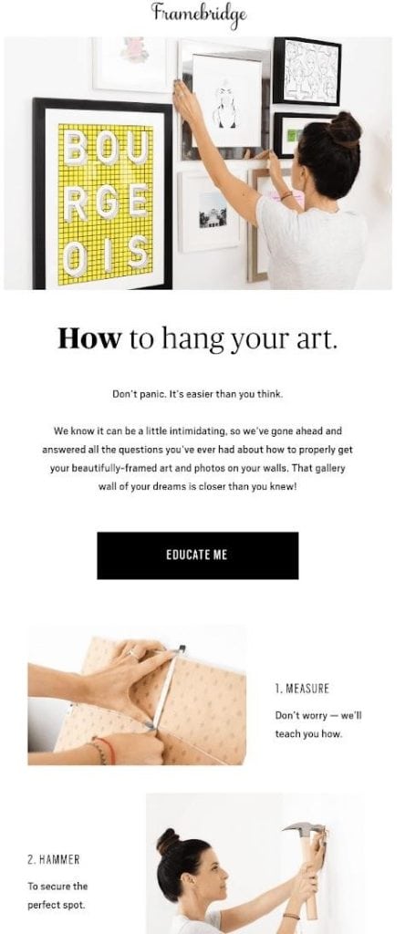
Why it works: Framebridge’s email stands out for its humour and the valuable information it delivers to the subscriber. This combination engages the reader and significantly enhances brand recall—a testament that offering something helpful can leave a lasting impression on your audience.
The email cleverly uses a tutorial format, offering tips on how to hang frames. This strategic content choice educates the reader and subtly reminds them of the need for frames, potentially influencing their purchasing decisions.
The Call to Action (CTA) placement within the email is meticulously strategised to draw attention and encourage clicks to their online store. This strategic placement ensures that after engaging with the content, subscribers have a clear, compelling pathway to purchase or explore Framebridge’s offerings further.
HeadSpace
Type | Goal | Source |
|---|---|---|
Newsletter | To generate more subscriptions | HeadSpace |
Newsletters are a staple in email marketing, usually dispatched on a weekly or monthly basis. Headspace, a well-known meditation and wellness app aiming to promote better sleep and mindfulness, utilised this approach by deploying aesthetically pleasing and thoughtfully designed emails to its subscribers in hopes of increasing their subscription base.
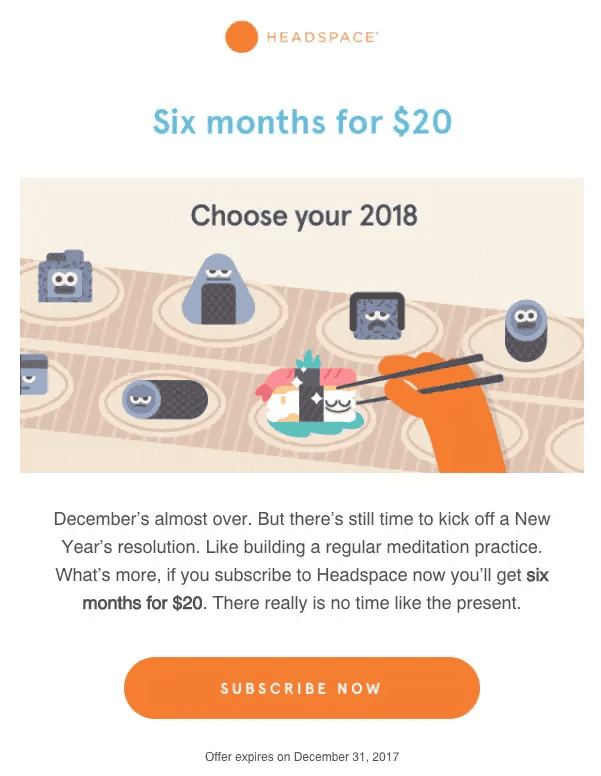
Why it works:
Engaging Storytelling: The newsletter captures interest through compelling storytelling, making the content not just informative but also engaging.
Strategic CTA and Design: A clear Call to Action (CTA) is paired with an attractive colour scheme, making the newsletter not only eye-catching but also prompting readers to take the desired action.
Motivational Content: The use of motivational phrases, like “Kick off New Year’s Resolution,” encourages readers to take positive action, aligning with the brand’s ethos of wellness and personal growth.
Sense of Urgency: By including a time-sensitive offer (such as 20 dollars for six months), the newsletter creates a sense of urgency, driving engagement and encouraging readers to act quickly.
These curated elements collectively reinforce the newsletter’s efficacy, blending creative storytelling with a visually appealing design and strategic messaging to motivate subscribers and attract new subscriptions.
General Assembly
Type | Goal | Source |
|---|---|---|
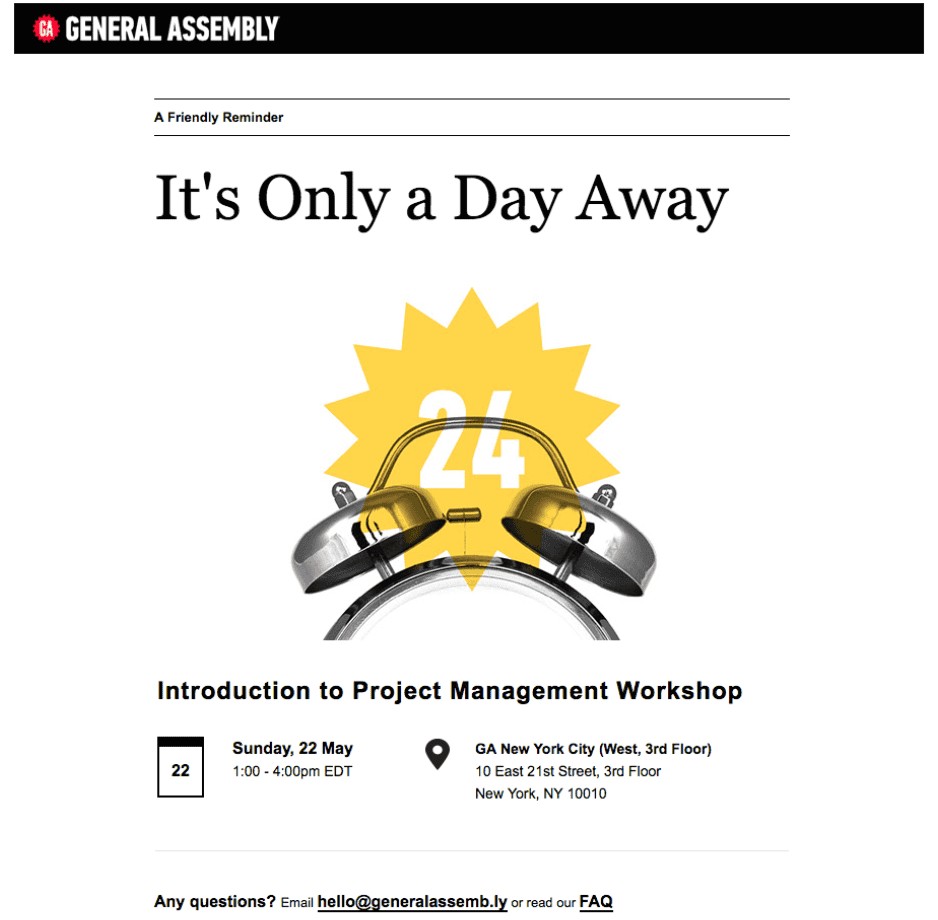
Reminder email | To increase the turn-around ratio and push potential leads further into the buyer’s journey. | General Assembly |
Many people register for webinars or events but often don’t show up. To help forgetful people, it’s a good idea to send out email reminders, which can help improve attendance rates and advance potential customers further along their purchasing journey.
An excellent example of such a reminder came from the Email Design Workshop:
Why it works:
Attention-Grabbing and Clear: The design of the email immediately stands out and it is simple to understand. It includes a prominent header image explaining the event and providing all the necessary webinar information.
Support Availability: By listing a contact email for support at the bottom, the template fosters confidence and offers help to anyone who might be confused about the event details.
Animoto
Type | Goal | Source |
|---|---|---|
Re-Engagement Email | Rekindle interest among subscribers who have become less active or unresponsive. | Animoto |
Send re-engagement emails to former active customers who have since disengaged from your email marketing efforts. When done well, these campaigns can decrease churn rates and increase customer engagement. Consider the re-engagement strategy employed by Animoto:
Why it works:
Direct Query: Animoto poses a simple yet effective question to reignite communication: Do recipients still wish to receive messages from them? This approach centres on awakening user interest to prompt an action.
Action-Oriented CTA: The Call to Action is designed to encourage recipients to take immediate steps by updating their email interaction preferences, be it to opt in or out. They are directed towards a preference centre to make their choices clear.
This method aims to rekindle the interest of lapsed subscribers and empower them to customise their email engagement with the brand.
Austrian Airlines
Type | Goal | Source |
|---|---|---|
Thank you email | To deepen loyalty, encourage repeat business, and potentially prompt positive word-of-mouth recommendations. | Austrian Airlines |
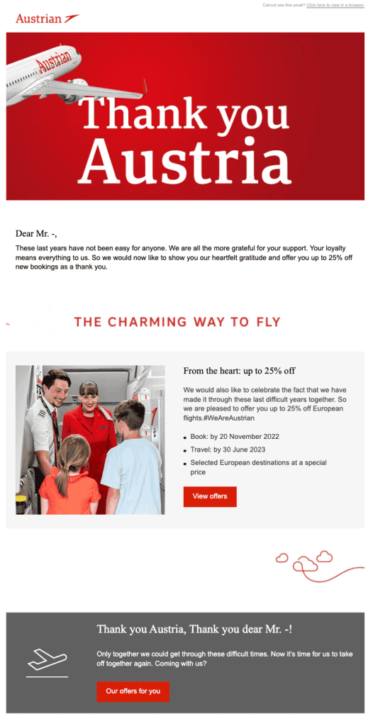
Acknowledging customers with a ‘Thank You’ email effectively conveys appreciation and makes them feel valued. Sending such a message after a purchase, an interaction with your content or website, or celebrating their loyalty can improve customer relationships. Take the example from the campaign initiated by Austrian Airlines:
Why it works:
Gratitude with Perks: The campaign extends gratitude to the passenger for their continuous airline preference. Further sweetening the gesture, it offers them a 25% discount to enhance their next travel experience.
Personal Touch: Beginning with the use of the flyer’s first name, the email employs personalisation to forge a more intimate connection. A genuine, appreciative note initiates the communication, emphasising the personal element of the message.
This strategy expresses thanks and simultaneously incentivises repeat business, nurturing a continuous and rewarding relationship with the airline’s clientele.
Medium
Type | Goal | Source |
|---|---|---|
Membership email | Welcoming and communicating platform features to the user | Medium |
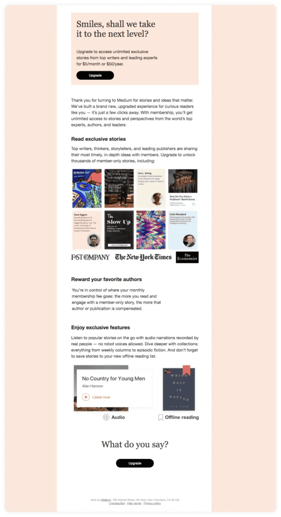
Medium, renowned as a leading platform for newsletters, skillfully engages its audience via email communications. Look at this example where Medium dispatched emails to its subscribers, urging them to upgrade their plan.
Why it works:
Engaging Visuals: The campaign smartly integrates images of books, captivating the subscribers’ attention and aligning with their interests in literature and reading.
Extended Reading Format: Acknowledging the preferences of its reader base, Medium employs a longer format for the content, tapping into the subscribers’ proclivity for in-depth reading.
Concise CTA and Feature Showcase: The email distinctly highlights its Call to Action, encouraging subscribers to upgrade. It also efficiently showcases the app’s features, making a compelling case for the membership plan.
This approach underscores Medium’s understanding of its audience’s preferences, using tailored content and visual strategies to effectively communicate the benefits of an upgraded membership.
The New York Times
Type | Goal | Source |
|---|---|---|
Newsletter | To share curated content with subscribers to engage engagement. | The New York Times |
The New York Times, recognised for its newsletter offerings, excels in delivering information in a concise and minimal manner, alongside providing an outstanding mobile experience for users, which extends into their email communications as well.
Take this example:
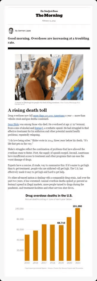
Digestible and Engaging Content: The email is designed to provide content that is easy to consume, making it an effortless read for subscribers who value quick and accessible information.
Multi-device Optimisation: Recognising the diverse ways in which subscribers access their content, the email is optimised for a variety of devices. This optimisation guarantees that whether the email is viewed on a smartphone, tablet, or desktop, the reading experience remains smooth and uninterrupted.
This approach underlines The New York Times’ commitment to facilitating an exceptional reading journey, by ensuring their content is both engaging and universally accessible, enhancing overall subscriber satisfaction.
BuzzFeed
Type | Goal | Source |
|---|---|---|
Follow-up email | Designed to engage and nurture leads as they move through the purchasing journey. | BuzzFeed |
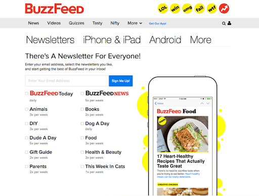
BuzzFeed’s email marketing strategy is based on list segmentation, which allows subscribers to select the categories of emails they wish to receive from BuzzFeed.
This approach proves particularly potent for brands engaging a broad audience spectrum. It enables the curation of content that aligns precisely with subscriber preferences, ensuring that recipients receive the most relevant content.
The image below displays the angle of available BuzzFeed email newsletters. There’s truly something for every interest.
Why it works:
Personalisation: By allowing subscribers to choose their interests, BuzzFeed ensures that the content is highly personalised. This personalisation makes the emails more relevant to each individual, increasing the likelihood of engagement and interaction with the content.
Targeted Content Delivery: With segmentation, BuzzFeed can customise its content delivery to specific subsets of its audience. This means subscribers receive content that aligns with their preferences, enhancing the user experience and fostering a stronger connection with the brand.
Increased Subscriber Satisfaction: When subscribers receive content that interests them, their satisfaction with the email communications increases. This satisfaction can lead to higher open rates, more click-throughs, and ultimately, a more engaged audience base.
Catchy Headlines: BuzzFeed’s use of intriguing headlines plays a significant role in driving engagement. These headlines capture attention and intrigue, attracting subscribers to click through to read more, thus improving the effectiveness of the campaign.
TED
Type | Goal | Source |
|---|---|---|
Newsletter | To Share educational content in order to gain more traction. | TED |
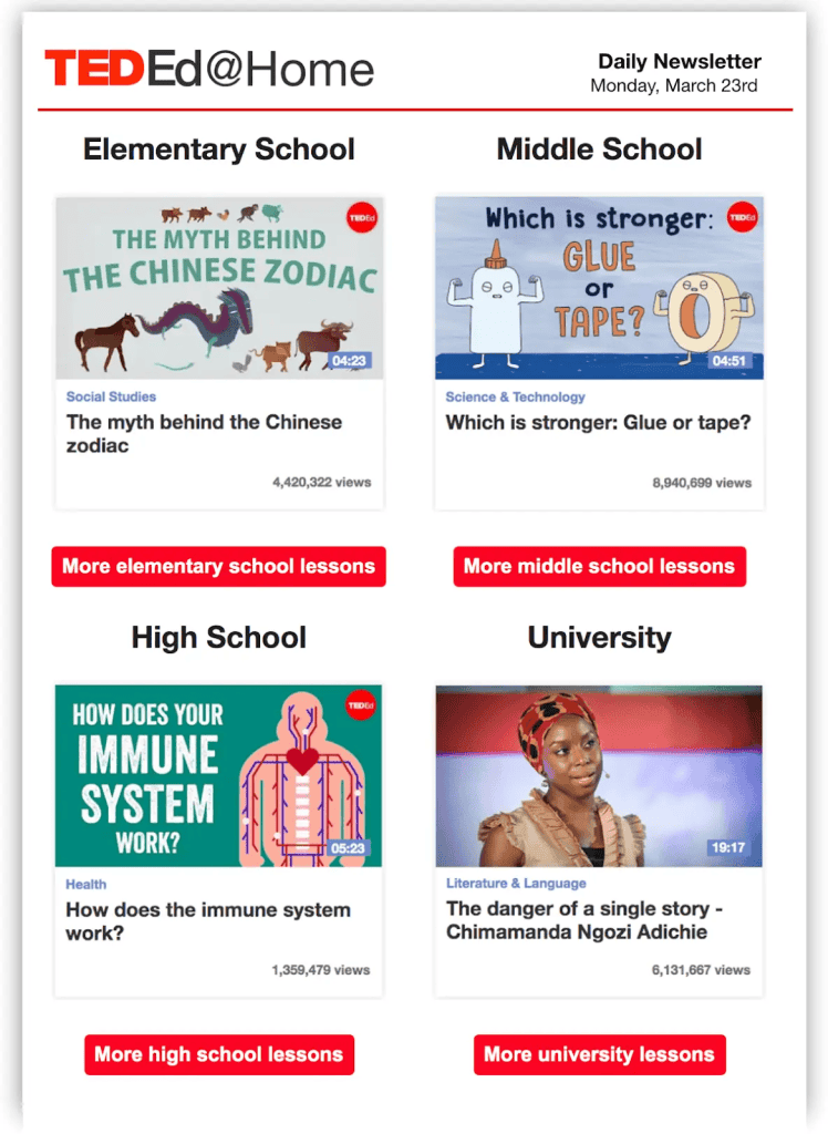
TED’s newsletter is renowned for distributing compelling lectures on a wide range of subjects, offering subscribers a daily infusion of enlightenment and encouragement.
A particular instance is seen with TED Ed@Home, which utilised engaging imagery and narratives from their array of educational content to distribute to their subscribers.
Why it works:
Targeted Educational Categorisation: The newsletter is proficiently divided to serve different educational levels, ranging from school to university tiers, enabling a tailored educational experience for learners at various stages.
Visually Appealing Educational Content: Captivating illustrations and visuals are specially customised to resonate with the subscriber’s educational comprehension and stage. This thoughtful inclusion of visuals enhances engagement and fosters a deeper understanding of the material.
Missguided
Type | Goal | Source |
|---|---|---|
Re-engagement email | To urge the customer to visit the website and the shop | Missguided |
Missguided, a retail outlet specialising in up-to-date attire for today’s women, initiated an email campaign aimed at reconnecting with inactive customers. Their strategy for re-engagement was carefully crafted, integrating several elements designed to capture attention and encourage interaction.

Why it works:
Compelling and Relevant Copy: The email content is meticulously crafted, ensuring that every word resonates with the target audience, thereby making the message both appealing and pertinent to the readers’ interests and current trends.
Incentivising Customer Re-engagement: By offering rewards for customers who decide to re-engage with the brand, Missguided effectively motivates dormant subscribers to take action, building a renewed interest in their product offerings.
Strategic Use of Emojis: The employment of emojis as a means to break up the text not only adds a visual interest but also makes the content more digestible and engaging, facilitating a smoother flow of information.
Emphasis on the Word “FREE”: Highlighting incentives, especially the use of “FREE,” captures attention and emphasises the value proposition to the customer, making the offer more enticing and hard to ignore.
Creative Language and Puns: The use of clever wordplay, exemplified by puns like ‘solemates’ for shoe advertisements, injects a sense of humour and personality into the message. This creative approach strengthens the connection with the audience by making the brand feel more relatable and engaging.
The combination of these strategic elements within their email showcases Missguided’s deep understanding of their audience’s preferences and behaviours, making their re-engagement campaign highly effective.
Wordsmith. Caffeine enthusiast. A full-time business-oriented writer with a knack for turning the ordinary into extraordinary. When not working, you can find Ishan listening to music, reading or playing with doggos.



![What Is Email Marketing [Detailed Guide] email marketing](https://www.feedough.com/wp-content/uploads/2022/08/email-marketing.webp)
