Repeat after me: Logo development is more of strategising than actual designing. I don’t really need a designer to develop a logo for my business. All I need to do is to get my basics right.
In the past couple of years, the demand for logos has increased tremendously and designers have started charging thousands (and some even millions) of dollars to design a logo that is mostly strategised by you.
But honestly, logo designing is simple. Most of the famous logos we know are actually normal typefaces. Take Google, for example. Designers say the green (non-primary) colour in L is to show how Google defies the rules. More of strategising, isn’t it?

Or Amazon’s logo. It’s a simple typeface with an arrow linking a to z to show amazon has everything from a to z.

All it takes is strategising –
- How it will look on brand collaterals?
- What will it depict?
- Will it represent the company’s brand identity and personality?
- How will people perceive it?
After reading this logo development guide, you should be able to develop your own logo for your business without hiring a designer for it.
What Is A Logo And Why Do You Need One?
A logo is a textual and/or pictorial symbol representing an organisation. It forms a part of the brand identity and helps the target audience identify and recognise the company easily.
So, is the logo really important?
Well, a simple answer – yes.
Logo is considered to be one of the most important branding investments of a company as –
- It is the face of the company which grabs attention and is usually the one making the first impression,
- It forms a vital part of brand identity,
- It helps in making brand memorable,
- It separates a brand from the competition, and
- Your audience expects you to have a logo.
Can You Design A Good Business Logo Yourself?
Developing a good business logo without hiring a professional graphics designer is highly possible, given you draft your brand identity well, learn the basics and principles of logo design, find good inspiration, and strategise well. Here’s every step explained in detail –
Step 1: Discovery
The first step to designing your business logo yourself is to discover what your brand is all about and how you want your target market to perceive it and differentiate it from others.
Define The Brand Identity And Brand Personality
Personify your brand and assign human traits and characteristics to it. Strategise how you want your customers to perceive it.
Assigning human traits gives rise to a brand personality and strategising the perception gives rise to the brand identity. Almost every branding decision revolves around these two strategies.
Take Woodland for example. The marketers and brand strategists assigned traits like outdoorsy, rugged, and adventurous to the brand and wanted the target group to remember it every time they thought of adventure and nature.
This premise made them choose green as the brand colour and include a tree in their logo.

Do A Competitor Analysis
Just defining your brand identity and personality is not enough. You have to make sure that you stand out from the crowd. For that, you need an extensive competitor analysis. Research and analyse –
- What type of logo do your competitors use for their brands?
- What makes their brand stand out. What images and texts have they used in their logos?
- How do they make the target audience recognise them and differentiate them from others?
- How do they use their logos on their brand collaterals?
Competitor analysis helps you not only find inspiration from your competitors’ logos but it also helps you develop a strategy to stand out and develop your own logo and branding strategies.
Suppose that I want to develop a logo for my new in-game VOIP application. My first step will be to build my own brand identity based on my product, its USP, and its value proposition.
I might use a rebel personality as that’s what most gamers love, and I might use a darker shade colour as it will support my identity.
Now, after doing a competitor analysis, I found out that most of my competitors like Discord, TeamSpeak, and Mumble, use a direct value proposition as their logo – a face-like structure wearing headphones or any structure which resembles games or gaming accessories.

Discord’s logo resembles a bot which resembles a game controller. They even have a name for this logo.
Mumble’s logo is an M shaped gaming headset. And TeamSpeak logo is a depiction of the actual gamer.
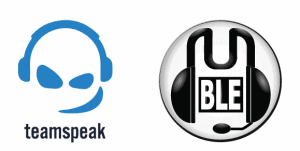
Now, this analysis is important for me to learn how these in-game VOIPs differentiate themselves from other VOIPs like Skype and Viber.
Step 2: Learn & Strategise
Know More About The Types Of Logos Available
A logo can be categorised into ten available types. These are –
- Wordmark: Simple font-based logo, like that of Coca-Cola.
- Logotype: A simple font-based logo but with symbolism within text design, like an arrow within the FedEx logo.
- Lettermark: A logo made up of only initials of the brands having big brand names, like HBO for example.
- Pictorial Mark: Graphic-based logos like that of Snapchat or WWF.
- Abstract Mark: Graphic-based logos which are made up of abstract or unrecognisable images, like that of Pepsi, Adidas, etc.
- Mascots: Pictorial logos having an illustrated character, like Colonel Sanders of KFC.
- Combination mark: Logos that are a fusion of a pictorial mark and a wordmark. For example, Doritos, MasterCard, etc.
- Emblem: Logos with a traditional outlook of brand name inside a symbol or icon, like that of Harvard.
- Contoured Words: Logos with brand names within geometric shapes. For example, Samsung, BBC, etc.
- Dynamic Logo: Adaptable logos that can be changed according to the context they are placed in, like that of MIT Media Lab.
I’d suggest reading this guide explaining which companies use which type of logos and when should you choose which type of logo for your brand.
Assign Adjectives To The Brand And Mention Its Traits
The best way forward to designing your own logo is to assign adjectives to it. These adjectives can either complement your value proposition or even your long term brand objectives.
- Is your brand innovative?
- Do you want customers to perceive your brand as a complete solution in the niche you operate in?
- Do you want to be perceived as a coach/guide?
- Is your brand a rebel?
- Do you consider your brand as a frontrunner in every industry trend?
Assign as many adjectives as you can. Then sort the adjectives according to relevance. These adjectives give ideas about the shapes, typefaces, and colours you can use in your logo.
Take Oral B for example. Here are some adjectives describing its traits –
- Caring
- Reliable
- Gentle
- Safe
- Innovative
All these traits give a hint to use the colour blue and a circle in the logo. Being caring also suggests that the letters should be close to each other. And being gentle and safe suggests using a font which is more rounded than one having more corners.
And hence the logo –
Intrigued how I came to this inference? It’s simple. All you need to do is to study more about –
(It won’t take more than an hour to study all three)
Get To Know About The Basic Principles Of Logo Designing
Before you go on developing your own business logo, you should get some of the logo principles right.
- The Design Should Be Simple: Logo is targeted towards the masses and not just art enthusiasts. It should be as simple and rememberable as possible.
- It Should Be Scalable And Versatile: The design should be created keeping in mind the future of the brand. If you’re currently operating a gym and want to get into the healthcare industry in the near future, don’t just focus on the gym while designing your logo.
- The Design Should Not Rely On Colour: Logos are printed on varied structures and are often printed using just black ink. A logo which solely depends on colour variations might lose its essence in such situations.
- The Design Should Be Timeless: The logo design is created once for the lifetime of the company. Never follow the trends and focus on building a valuable long-term brand identity using your logo.
- Size Shouldn’t Matter: A highly complex logo might lose its essence when printed on small paper or surfaces. Develop a logo that can be easily recognised irrespective of the print size.
Step 3: Get Inspiration
Believe me when I say – no logo is original. Every logo is either copied or inspired by some other logo or design created by someone else.
Airbnb’s logo is inspired by a design in the book Logo Modernism.

Medium’s logo is almost an inverted copy of Metrocraft Publishing’s logo.

Now, if you get the right inspiration, designing a good logo becomes a lot easier as all you have to do now is to morph the inspiration to fit your identity.
Here are a few websites and resources which you can use to find inspiration for your logo –
- Logobook: Showcase of finest logos, symbols and trademarks.
- Dribbble: Community of designers where they showcase and share their work.
- Designspiration: Website for designers to find inspiration.
- Behance: Platform where designers showcase their portfolio.
- Brand New: A blog that covers designs and redesigns of notable brands.
- Logo Design Love: A website to find new designs and also the stories and logic behind those designs.
Step 3: Logo Creation
Inspiration always leads to creation. Once you’ve found the right inspiration, find the right tool to put your thoughts down into graphics that actually represent your brand. A little bit of editing to that graphic and you’ll be ready with your logo.
But choose the logo software carefully. Choose the professional tools only if you’re willing to spend at least a week to learn how to use it. But if you don’t have much time, there are some logo-centric designing tools which can make your task a lot easier.
Here are some of the recommended logo creation software –
- Adobe Illustrator: It’s a part of the Adobe Creative Suite and is considered to be the kingpin of graphic design software. With the given features, vector design, and easy integrations with graphics tablets, you can create almost any type of logo with Illustrator. However, it requires some time to learn and master. But there are loads of videos online to help you in mastering illustrator.
- Corel Draw: Corel Draw is similar to Illustrator, just with some fewer features as compared to the latter. This logo creation software is a perfect choice if you want to create or edit vectors, use graphics tablets, and create original logos backed by your imagination and inspiration.
- Canva: Canva is the perfect example of technological advancement when it comes to graphics and logo design. It’s a freemium online tool which comes with thousands of editable templates which you can choose and edit to meet your needs. Creating a logo on Canva mostly involves you to drag and drop elements that you want in the logo and editing them. It is a great choice for anyone who’s not much into design, yet wants a professional looking logo.
- Logomaker: Logomaker is an automated logo maker for those who want a logo but don’t want to spend a lot of time and money in developing it. The tool makes you type your brand name, select some graphic and typography styles you like, and comes up with some logo designs according to your taste, which you can edit before buying and downloading.
- PlaceIt: Placeit is another online graphic designing tool, just that it is not just for logos and can be used to develop your entire brand identity with few clicks. The tool works in a similar way as Logomaker but has many more features to help you create your own logo and even other brand collaterals.
Don’t Make These 5 Logo Development Mistakes
No matter which logo development software you choose, just don’t make these five logo development mistakes –
- Using stock art: While this may seem the easiest way to develop your own logo, stock art, even though paid, isn’t exclusive to you and is usually used by hundreds of other designers. Using stock art automatically makes your logo unoriginal.
- Sticking to the clichés of your industry: It isn’t necessary for a hotel booking portal to have a hotel in its logo. it’s the same with packers and movers or any other industry-specific business. Keeping away from clichés makes you seem more original and stand out.
- Complicating it: Keep this in mind while developing the logo for your business – the target audience should be able to identify and remember it easily. Simple logos fits best to this requirement. Moreover, a logo is printed on collaterals of varied sizes. Overly complicated logos lose detail when printed in small places or different structures.
- Following the trend instead of looking long term: While trends bring in more eyeballs for the short term, brand building is a very long-term process. Focus more on long-term growth while developing your logo.
- Relying on Colour for effect: A big mistake logo designers do is that they focus more on colour as effects. But the logos are often printed with black and white ink which makes them less recognisable and make them lose their effect. Make sure you focus more on structure than colour to add effect.
Final Thoughts
Developing your own logo isn’t a walk in the park. But it’s not an uphill struggle as well. All you need to do is study the basics, learn some tools, and strategise well.
After all, logo development is more of strategising than designing.
Go On, Tell Us What You Think!
Did we miss something? Come on! Tell us what you think about our article on how to design a business logo in the comments section.
A startup consultant, digital marketer, traveller, and philomath. Aashish has worked with over 20 startups and successfully helped them ideate, raise money, and succeed. When not working, he can be found hiking, camping, and stargazing.
![How To Design A Logo Yourself [Detailed Guide]](https://www.feedough.com/wp-content/uploads/2020/03/design-your-business-logo.png)


